I’ve noticed in my workshops recently that people can react completely differently to the same pointed nib. Some people are more heavy-handed than others, some people hold their pen higher than others, some people can’t quite get the angle right. All this can have an impact on the way to nib reacts to the paper, and the flexibility of the nib can make a huge difference.
How a pointed nib works
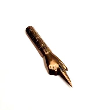
Pointed nibs respond to pressure to create scripts like traditional copperplate and modern calligraphy styles.
When you press down, the tines of the nib split and the ink has a wider channel to flow through, thus creating a thick line. When that pressure is lifted, the ink has a thinner channel to flow though, creating a thin line. As you write, pressure is applied on the downstroke and lifted on the upstroke, creating the thick and thin lines that are synonymous with calligraphy.

Finding the right nib
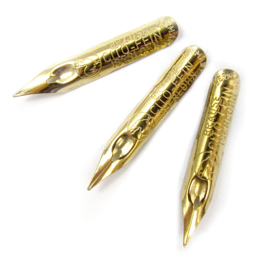
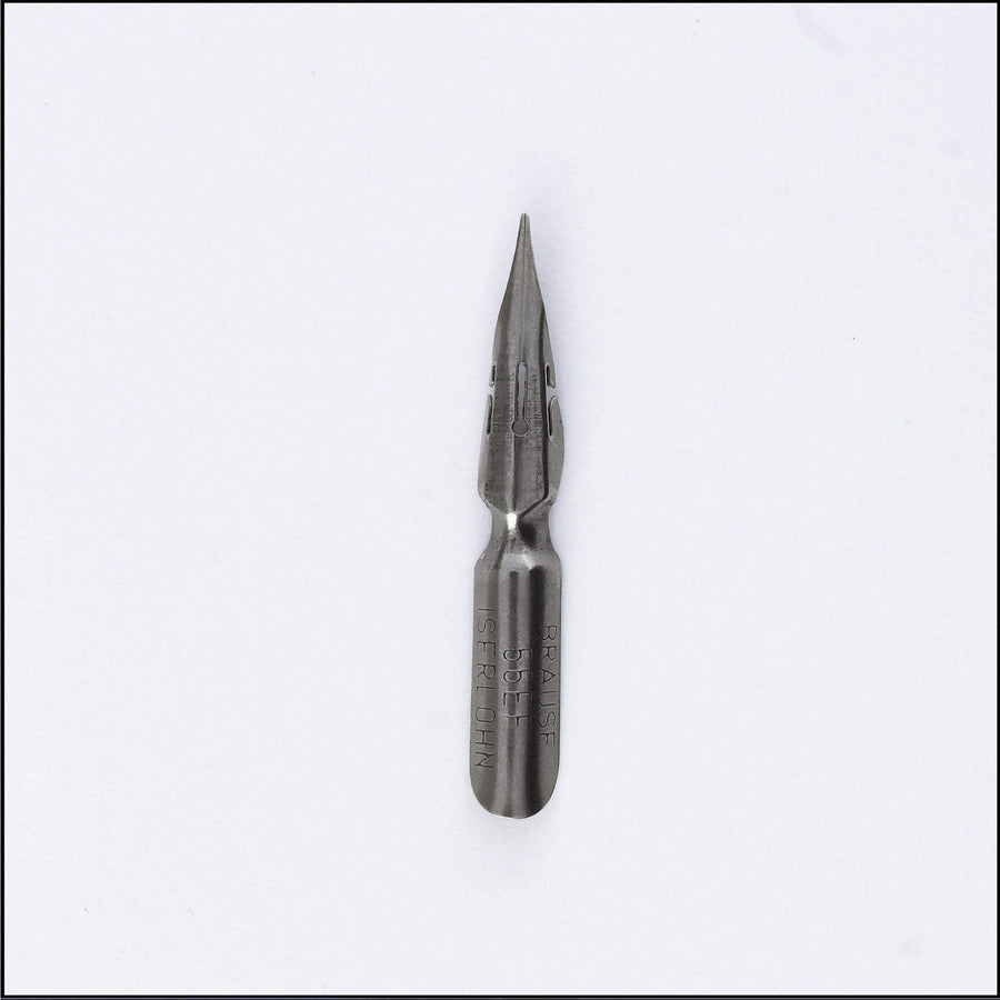
Choosing the right nib can be a daunting task when there are so many available. I started learning copperplate with a German-made Brause EF66, which is a tiny nib but strong and very flexible, so you get nice thick lines.

Joyce Lee from Artsynibs Studio then introduced me to the Nikko G – pretty much the industry standard for modern calligraphers! The Chrome-plated Japanese nib isn’t as flexible as the EF66, but you still get good definition between thick and thin and it’s a smooth writer. I use it in my workshops now, as it’s great for people to get started with, but I still like to have some alternatives to hand. The Modern Calligraphy Set from Manuscript Pen Company Ltd, curated by Joyce, includes three nibs made in the UK – a Leonardt 30, a Leonardt 40 and a Leonardt EF Principal. Everyone found one to suit when I included the set as part of my kit at Middleton Lodge in North Yorkshire recently. I’ve also tried a stack of vintage nibs that were gifted to me by English Pen Crafts. You can read the blog post here.
What do the professionals recommend?
I’m fortunate to be part of a calligraphy community that is very keen to share expertise! When I asked some fellow calligraphers and tutors for their opinions on nibs, the responses definitely threw up a few favourites. Kayleigh Tarrant, like me, is a creature of habit and sticks to her favourites – Nikko G and Zebra G for inks and a Brause 361, also known as the Blue Pumpkin, for metallics. Julia Broughton, of Letters By Julia, agreed, describing a Nikko G and a Blue Pumpkin as her “dream team”. Lauren Smith, of A Little Pigment, has tried the Nikko G, Brause EF66, Brause Rose, Leonardt EF Principal and the Blue Pumpkin. But the one she keeps going back to is a William Mitchell Post Office nib. “I haven’t heard yet of anyone else using this one and I don’t know why because it really agrees with me for all kinds of inks and papers,” she said. “It’s not too flexible and produces really nice hairline upstrokes.” The Blue Pumpkin is the go-to nib for Leanda Xavian, of The Fine Letter Co, and she too finds it great for metallic. But she rotates it with the Brause EF66, Zebra G (more flexible than the Nikko G), Leonardt Hiro 41 and the Hunt 101.
Kate Watson, of Olive & Reid Studio, likes the Leonardt EF Principal, Hunt 22B, Blue Pumpin, Gillott 303 and the vintage Viktor Exhibition. Lauren Cooper, of Oh Wonder Calligraphy, favours the Nikko G and Esterbrook 358, which was a totally new one on me! Blue Pumpkin and Nikko G are also the top choices of Jacquie Laws, of Sugar and Spice Designs and Pinar Djemil, of Curious Me Design. Phylecia Sutherland, of Pure Heart Paperie, loves the contrast of thick and thin provided by the Brause EF66. And Lyndsey Gribble, of Anon Design Studio, has just added the Hunt 22 to her collection, a nib also admired by Joyce Lee of Artsynibs Studio.
Choosing the right nib for you
Calligraphers will have spent hours practising with various nibs to discover which one works best for them.

The choice of nib can also depend on the project you’re working on, the ink you’re using and the surface you’re writing on – some glide easier than others! There’s no shortcut, and it’s really a matter of experimenting with as many nibs as you can. Fortunately, most nibs can be picked up relatively easily and cheaply – the Brause EF66 and Blue Pumpkin are around the £1 mark and the Nikko G around £2. The suggestions in this post are a great place to start! And when it comes to looking after your nibs, read this blog post for some tips.
