


Whether you’re new to brush lettering, exploring modern calligraphy, or diving into the beautiful world of traditional dip-pen calligraphy, you’ll quickly discover that the creative lettering community uses a lot of specialist terminology. This glossary breaks down the most common vocabulary used by beginners and professionals — including pen types, techniques, strokes and materials — so you can feel confident as you learn, practise and shop for new tools.

This glossary covers essential terms used in brush lettering, modern calligraphy and traditional script work, making it ideal for beginners, students, creative journalers and artists exploring lettering techniques.
Contents
✑ Brush Lettering Terminology
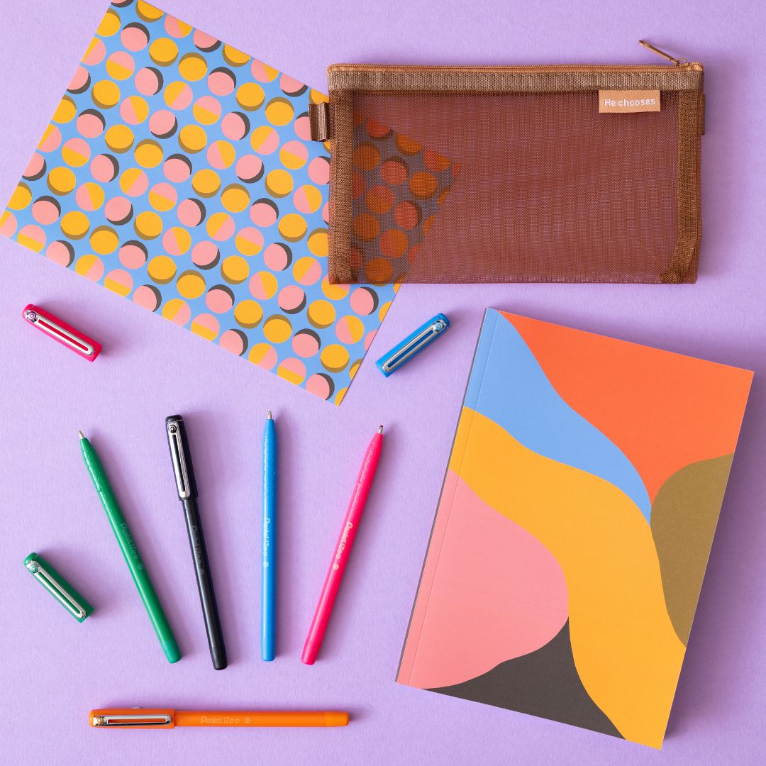
Brush Pen

A pen with a flexible tip that responds to pressure, creating thin upstrokes and thick downstrokes. Available in hard, medium, and soft tip varieties.
Try our curated brush lettering pens.
Hard-Tip Brush Pen
A firmer brush tip used for small lettering, journaling, planners and beginners who need more control. Common in Pentel Touch and Tombow Fudenosuke pens.
Soft-Tip Brush Pen
A flexible tip that allows greater stroke variation and expressive lettering. Popular for larger headings and artistic pieces.
Downstroke
A stroke made while applying firm pressure to create a thick line.
Upstroke
A stroke made with light pressure to produce a thin, delicate line.
Bounce Lettering

A playful brush lettering style where letters dip above and below the baseline for a lively, flowing look.
Blending

A technique where two colours are combined directly on the page or on a palette to create gradient effects.
Bleed-Proof Paper
Smooth paper that prevents ink bleeding and protects brush pen tips from fraying.
Pressure Control
The skill of adjusting pen pressure to create thick and thin lines — a core foundation of brush lettering.
Bristol Board
A smooth, heavyweight paper ideal for lettering practice and final artwork.
Dual-Tip Brush Pen

A pen with a brush tip on one end and a fine liner on the other, useful for lettering plus detail work.
See our dual-tip lettering pens.
Shadowing
Adding soft grey or coloured shadows to lettering to create a 3D look.
✑ Modern Calligraphy Terminology
Modern Calligraphy
A contemporary style of calligraphy that allows more creative freedom than traditional scripts. Often created with pointed nibs or brush pens.
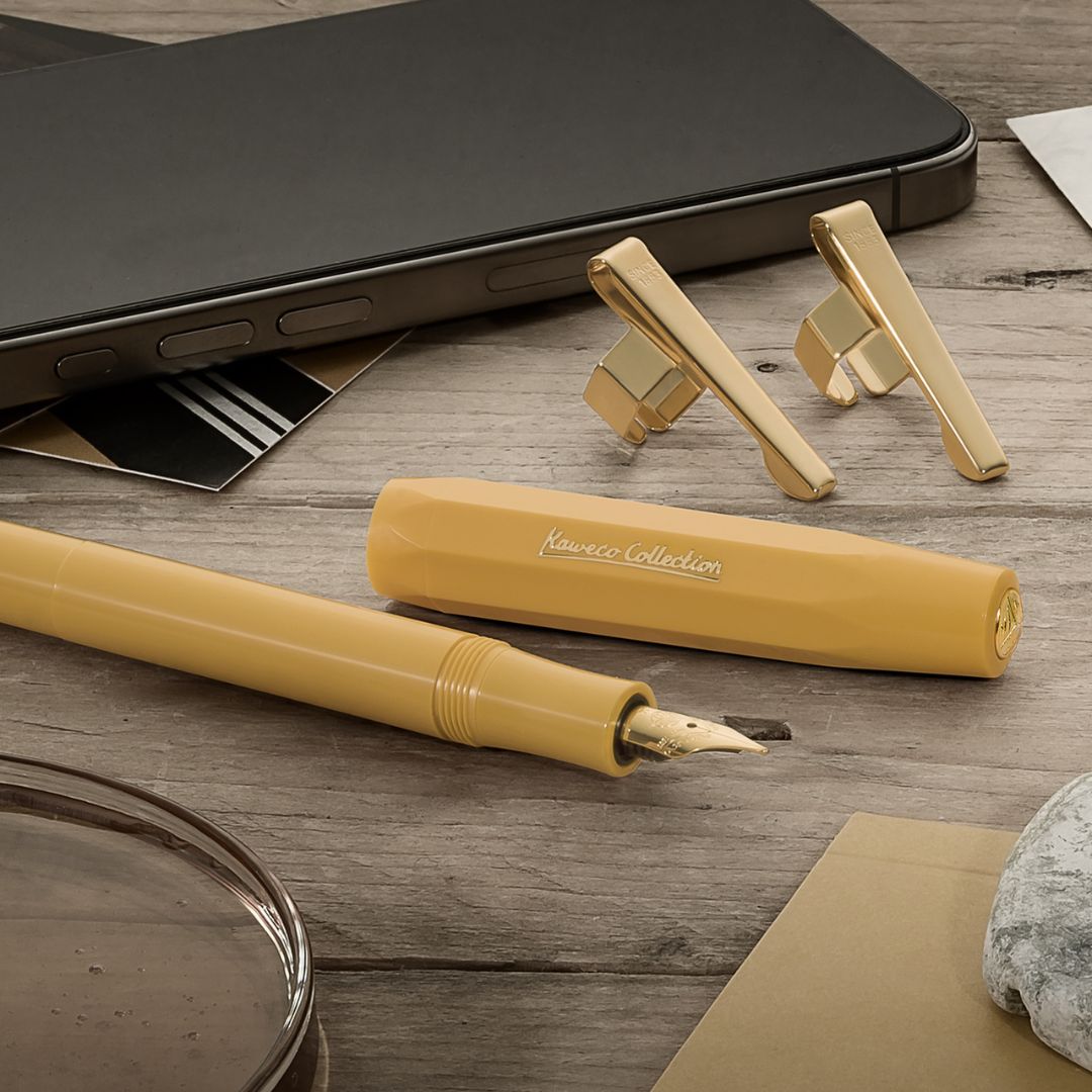
Pointed Pen
A flexible dip-pen nib used in modern calligraphy to produce varying line widths based on pressure.
Browse our range of Dip Pens.
Nib

The interchangeable metal tip of a dip pen used to hold and guide ink.
We stock nibs individually and in sets.
Nib Holder

The handle that holds a nib. Comes in straight and oblique versions.
Straight Holder

A nib holder aligned in a straight line, ideal for beginners and upright lettering styles.
Oblique Holder

A holder with an angled flange that helps achieve slanted calligraphy styles, especially Copperplate and Spencerian.
Copperplate Script
A classic, slanted script style often used in modern calligraphy — elegant, flowing, and built on thick and thin strokes.
Flourishing

Decorative loops and extended strokes added to letters for an ornate, expressive look.
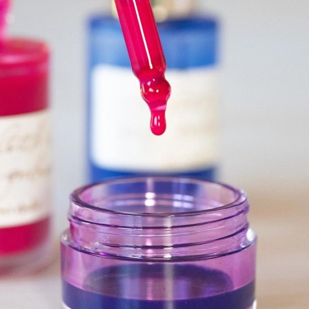
Ink Well / Dinky Dip
A small container for holding calligraphy ink during practice sessions.
G Wash / Gum Arabic
Additives used to adjust ink flow, thickness or smoothness.
Ligature
When two letters are connected in a stylistic way to create a unified shape.
Guidelines

Pre-printed or digital practice sheets that help maintain consistent height, slant and spacing.
Underturn / Overturn
Basic stroke types used when learning modern calligraphy, forming part of letter construction.
✑ Traditional Calligraphy Terminology
Broad-Edge Pen

A pen or nib with a wide, flat edge used for scripts such as Gothic, Italic and Uncial.
Italic Script
A classic calligraphy style known for elegant diagonal forms and consistent thick/thin strokes — often taught in traditional calligraphy courses.
Blackletter / Gothic Script
A medieval script style characterised by bold, angular strokes. Typically created with a broad-edge nib.
Uncial
An ancient script style with simple, rounded letters — often recreated using broad-edge pens for decorative work.
Foundational Hand
A balanced, beginner-friendly style developed by Edward Johnston, forming a strong base for many traditional scripts.
X-Height
The height of the lowercase letters (excluding ascenders/descenders). Essential for keeping lettering consistent.
Ascender / Descender
Ascender: the part of a letter that rises above the x-height (e.g. h, l).
Descender: the stroke that drops below the baseline (e.g. g, y).
Letterform
The overall shape and structure of a letter. In brush lettering and calligraphy, each letterform is built from basic strokes that determine its style, rhythm and visual balance. Consistent letterforms are key to creating tidy, readable lettering.
Counter
The open or closed space inside letters like o, e, a, p, d. Counters affect readability and the “voice” of a script style.
Terminal
The open or closed space inside letters like o, e, a, p, d. Counters affect readability and the “voice” of a script style.
Stroke
A single movement of the pen that forms part of a letter. Strokes can be thick or thin depending on pressure, nib angle or tool type. Learning individual strokes (upstroke, downstroke, overturn, underturn) is the foundation of both brush and pointed-pen calligraphy.
Kerning
The spacing between individual letters. In calligraphy and lettering, kerning affects how words feel visually — too wide and they look disjointed; too tight and the letters become hard to read. Beginners often refine kerning as they gain control over rhythm and spacing.
Tracking
Overall spacing across an entire word or line of text. Tracking adjusts the collective spacing rather than the space between individual letters. It helps maintain airflow, readability and a consistent look across longer quotes or journal headings.
Serif
The small decorative lines attached to the ends of strokes in many traditional scripts.
Ink Reservoir

A small attachment on some broad-edge nibs that holds extra ink for longer writing sessions.
Manuscript Alphabet
A structured, formal alphabet created using strict proportions and guidelines.
✑ Material & Tool Terminology (Brush + Calligraphy)
Bleeding / Ghosting
Bleeding: ink spreads into the paper fibres.
Ghosting: ink shows faintly on the reverse side.
Waterproof Ink
Permanent ink ideal for final artwork. Not always suitable for beginners due to nib maintenance.
Try out a new waterproof ink today.
Non-Waterproof / Dye-Based Ink
Flowy, beginner-friendly inks perfect for practice.
Pigment Ink

Ink containing fine pigment particles — rich colour and archival quality.
Find pigment inks in every colour of the rainbow.
Practice Pad
Smooth, high-quality paper designed for lettering and calligraphy practice.
Sumi Ink
Traditional black ink used in both calligraphy and illustration.
Metallic Ink

Ink with shimmer-like particles used to add sparkle and dimension to calligraphy.
Ready to try these tools in your own lettering practice? Explore our curated brush pens, nibs, inks and paper supplies.